Entrepreneurial learning made easy
for the classroom

Project Type
Client Project
Duration
3 Weeks
Team
Eric Lieu
Jenny Lee
Sri Anuapama
Role
UX/UI Designer
Market Researcher
Methods
User Research
Competitive Analysis
Comparative Analysis
Affinity Mapping
User flows
Wireframing
Prototyping
Usability Testing
Tools
Figma
Figjam
Pen and Paper
Overview
Young Change Agents is a non-profit social enterprise focused on fostering entrepreneurial and design thinking in the classroom. This is done through the Entrepreneurial Learning Hub (ELH), which serves as a platform where both teachers and students can find program-related activities, resources and tools. Its aim is to assist teachers in guiding students through their entrepreneurial journey within the classroom. The client approached us with the goal of redesigning the workspace for the ELH, enhancing the site’s navigation thus making it more intuitive and engaging for users.
The Challenge
Students and teachers struggled with the current platform due to several key issues, including inefficient navigation, overwhelming content structure, confusing titles, and a lack of guidance on certain functions. All of which contributed to a steep learning curve.
Project Goals
This project aimed to create a more user-friendly and engaging platform for both students and teachers. By refining the navigation and enhancing the visual design with elements of gamification, our goal was to facilitate a smoother learning experience and foster greater student engagement.
Or
Understanding the Problem
In order to gain a clear understanding on the issues we were trying to solve, we conducted a thorough heuristic analysis and user testing for both the student and teacher platforms. In our findings, we discovered a number of key insights that informed our design decisions going forward.
Key Insights from Student Platform
1. Unclear language
Frequent misunderstandings arose from unclear naming and language. This resulted in challenging site navigation for the users as well as confusion with certain tasks.
2. Cognitive overload
Users were overwhelmed by the dense content and task layout, this made it hard for them to properly take in all the learning material and task requirements, especially for users from younger age groups.
3. Lack of editing and user control
There was a lack of editing, deleting, and updating features for tasks submissions resulting in users being unable to rectify potential mistakes in their work.
4. Visual appeal
Students expressed a strong desire for more engaging visual appeal to the platform, which would enhance their learning experience.

Key Insights from Teacher Platform
1. Unclear language
Frequent misunderstandings arose from unclear naming and language. This resulted in challenging site navigation for the users as well as confusion with certain tasks and functions.
2. Inefficient navigation and UI
There were too many unnecessary steps while navigating through and finding certain webpages as well as awkward placements of some UI elements, negatively impacting workflow. e.g. Notification pop-up can’t be retrieved after closing; requires page refresh
3. Lack of help and instructions
Teachers were confused about the purpose of certain tasks and how to perform them due to the lack of easily accessible instructions and helpful information.
Inspiration from Competitors & Comparators
I conducted a competitive and comparative analysis on a number of e-learning platforms to draw inspirations and key features that we could incorporate to address the users’ needs and pain points that were identified in the user research to improve the overall usability and experience of the ELH platform.
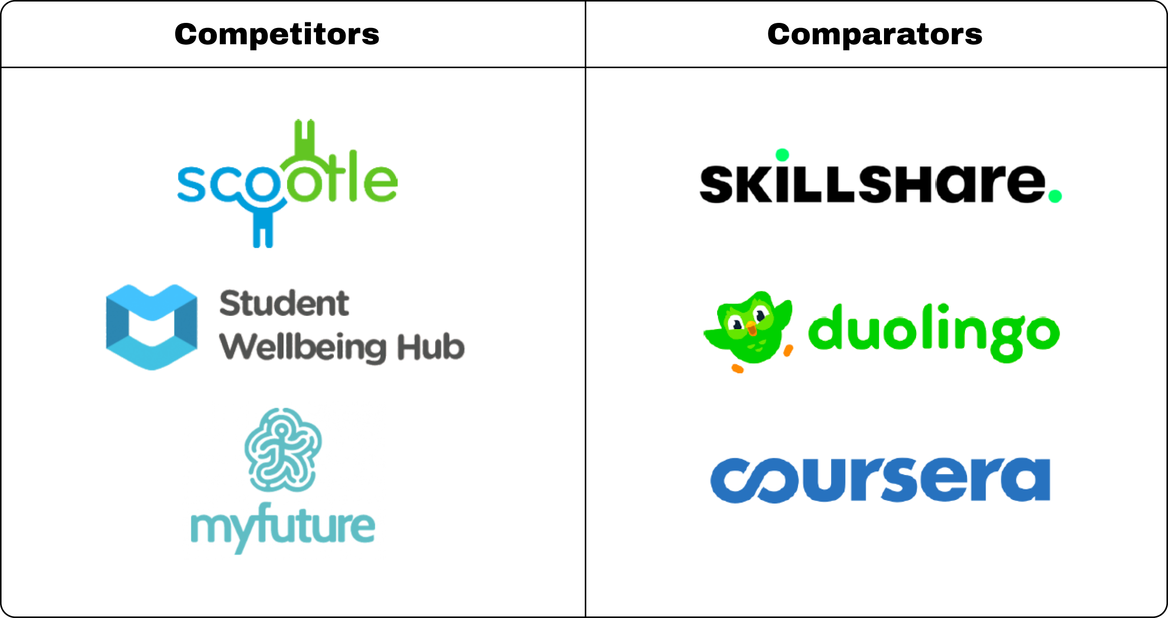
Key features incorporated from the research
- User Dashboard
Having a dashboard aims to create a more efficient navigation experience, displaying the most essential features that the user’s will need to complete their tasks. Student Wellness Hub utilised a dashboard as an easy access point for user’s tasks as well as insights into the user’s progress, grade, feedback and other important information. - User-Friendly Layout
Both competitors and comparators present elements on their platform with a user-friendly layout that is spacious and light on text with many platforms utilising cards to organise the content in a visually engaging manner. This approach allows the platforms to be more accessible, especially for user’s from younger age groups. - Clear Guidance
Clear and succinct instructions and help information aim to navigate users through the complexity of specific functions and tasks. Platforms such as Skillshare and Student Wellbeing Hub offer concise guidance on utilizing resources within their modules. - Progress Tracking
Allows teachers to monitor student’s performance and provide a way for students to visually see their own progression. Platforms such as Duolingo and Coursera commonly use this to keep track of user progress, which is also a good way to help motivate the users to complete tasks. - Gamified elements
Duolingo, Skillshare and Coursera rewards the user’s with achievements for completing certain milestones. This use of gamification aims to enhance the user’s motivation and engagement with the platform.
Initial Design and Prototype
After gathering the research, we took the findings and used it to inform our decisions moving into the design phase. Here we created user flows to illustrate the key tasks and steps students and teachers would ideally take while using the new design. With the user flow as a blueprint, we ideated on potential designs and created the first iteration of the solution with a low-fidelity prototype. These are the key tasks and user flows we focused on for the new design:
Student Platform
- Creating a new project
- Completing Workspace activity
- Submitting a project budget forecast
Teacher Platform
- Reviewing and grading student submission
- Approve forecast budget
Below are 2 examples showcasing user flows with the low-fidelity prototype. This includes the flow for “Completing Workspace activity” on the student platform and “Reviewing and grading student submission” on the teacher platform.
Student: Completing Workspace activity
User Flow

Low-Fidelity Wireframes

Teacher: Reviewing and grading student submission
User Flow
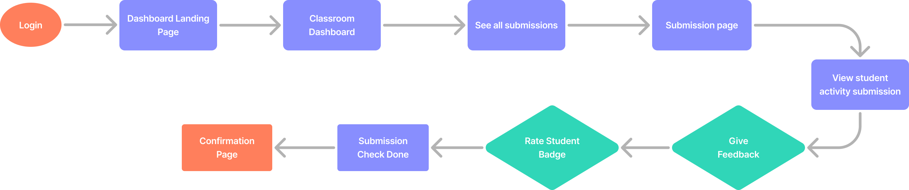
Low-Fidelity Wireframes

User Feedback from Usability Tests
We utilized the low-fidelity prototype to conduct usability tests with the same groups of students and teachers from the initial research phase. This allowed us to assess whether the new design direction effectively addressed the reported usability issues and pain points. The overall response was largely positive as users found the new design much easier to use and navigate. Users have also raised several points of feedback on the design that required our attention.
- More detailed confirmation pages
Both teachers and students expressed the need for confirmation pages to provide more detailed information about the recently completed task. This would reassure them that the information they entered was accurate or that the correct task was successfully submitted. - Additional dashboard content
To enhance the dashboard’s content and functionality, teachers suggested incorporating additional elements that facilitate faster access to student project information. - Easy access to Workspace activity content for teachers
Teachers highlighted the need of having an efficient method to view activity content while reviewing student submissions. This ensures clarity and accuracy in grading by allowing instructors to confirm the content they are evaluating.
The Final Design
After embracing the users feedback, we elevated the prototype to a high-fidelity version, incorporating the Young Change Agent brand colours and fonts provided by the clients. In summary, our approach centred on making the navigation more intuitive, aiming for visual appeal, and reducing the overall sense of overwhelm for users when completing tasks.
Main Features
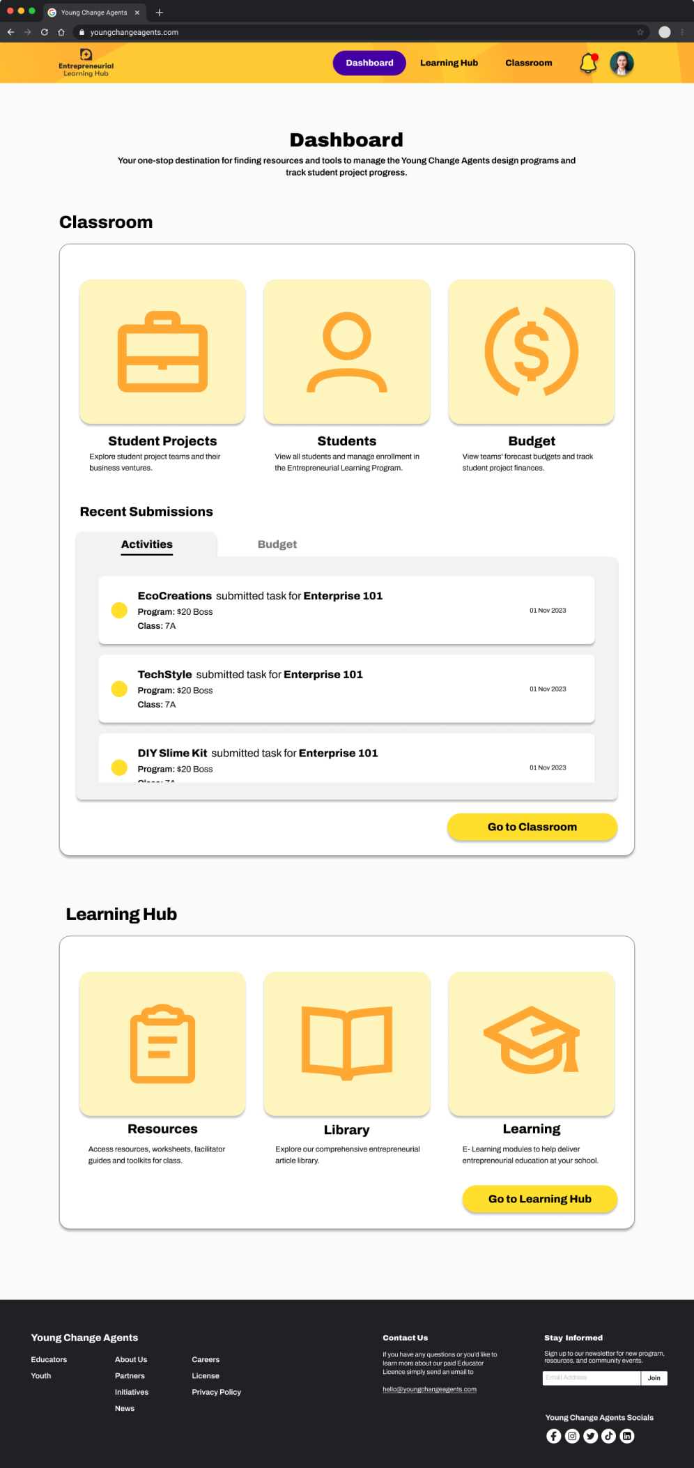
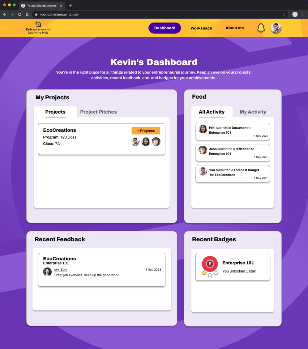
All-in-one Dashboard
Now, with the all-in-one dashboard, accessing essential information and pages has become effortless. This streamlined feature aims to create a more efficient navigation experience for both teachers and students, significantly reducing the number of steps needed to locate the required pages and tasks.
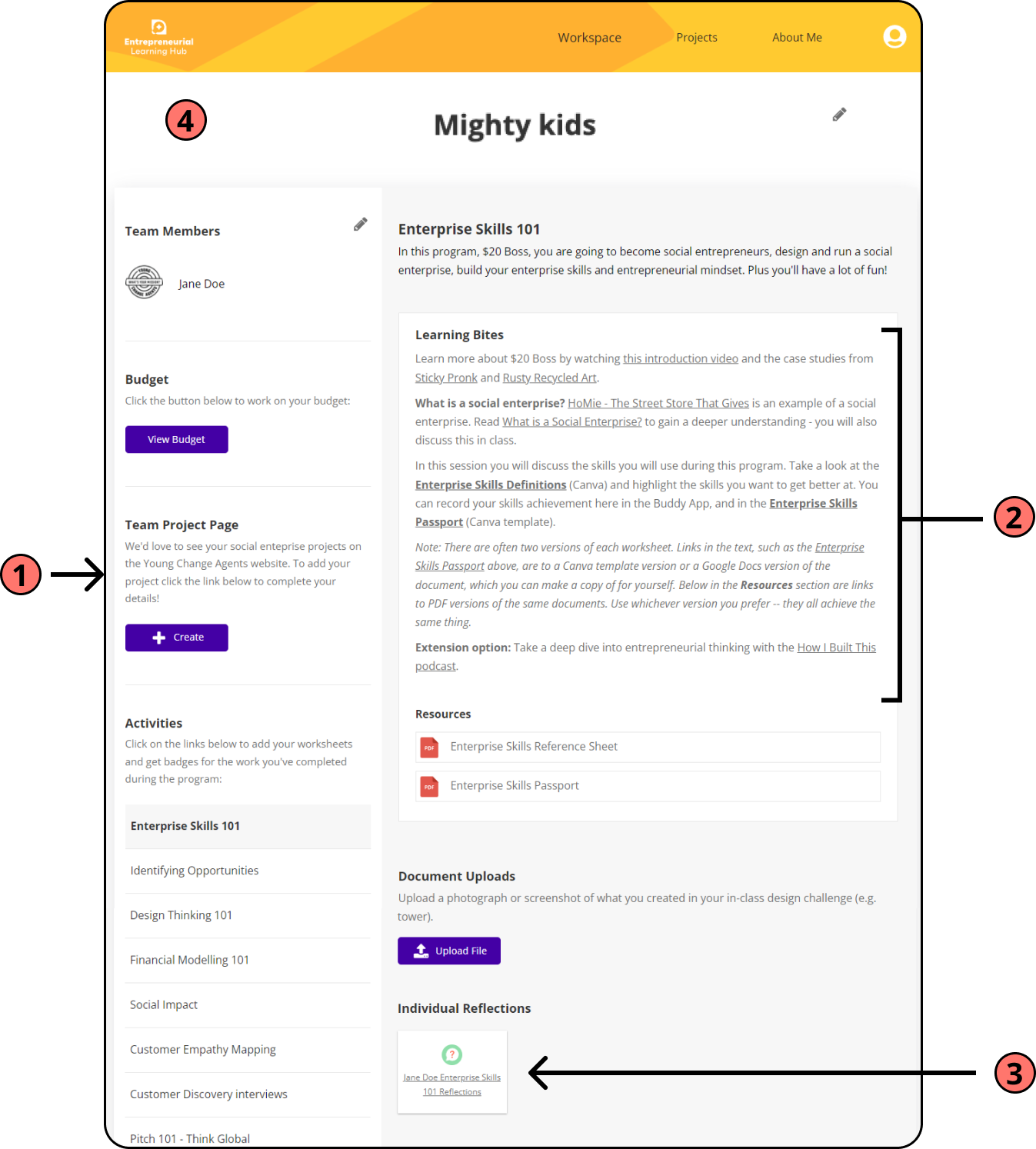
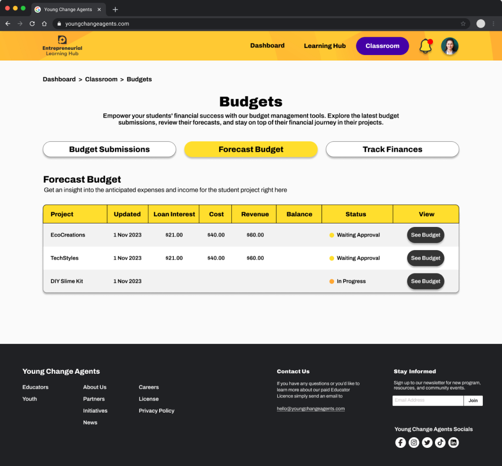
User-friendly Workspace
The student Workspace has been revamped to enrich the learning experience by reducing the cognitive load. This was achieved through breaking down learning materials into smaller, more digestible segments, thereby reducing the density of content on each page. Moreover, students can effortlessly locate other project-related tasks, such as managing the project budget, by seamlessly navigating through the tabs conveniently situated within the Workspace.

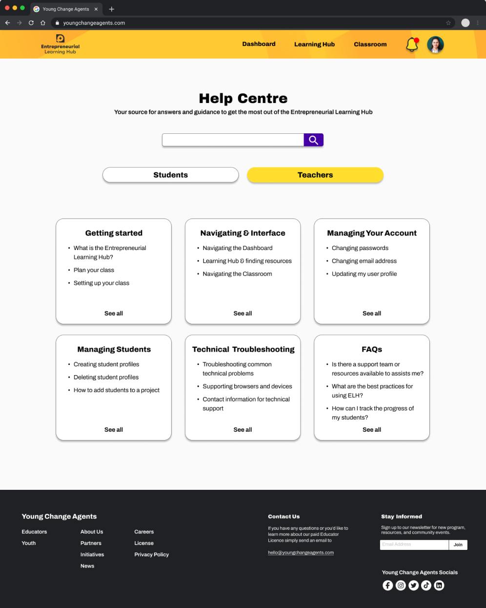
Clear guidance and
Help Centre
Teacher and student tasks and pages are now accompanied by clear instructions to prevent any possible confusion. Furthermore, the integration of a Help Centre serves as a valuable resource, aiding users in resolving any queries or issues they may encounter along the way.
Entrepreneurial Learning Hub Prototype

What I Learnt
Considering every stakeholder
Throughout this project, I gained insights into the importance of considering multiple perspectives within the client’s team. Realizing that the perspectives and needs of various stakeholders, including the project manager and developer, were crucial to designing the right solution.
Tailoring to the target audience
When it came to testing the website in the research and design phases, I realised how important it was to test with the intended target audience. Valuable insights from teachers highlighted essential aspects to meet their classroom needs, while testing with students of various ages ensured that our design was user-friendly for even the youngest users while still maintaining engagement for the older age groups.
Open communication with the client
Maintaining transparent communication with the client throughout the project was crucial. I recognised the importance of keeping the client informed about our progress and design decisions. This prevented any unnecessary ambiguity and allowed me to incorporate the client’s feedback more effectively. It ensured that every step of our work remained aligned with their vision while addressing their needs, fostering a collaborative partnership with the clients.
