Discover new activities and events near you with Locale
Project Type
Conceptual Project
Duration
3 Weeks
Role
UX/UI Designer
Methods
Competitive Analysis
Comparative Analysis
User Archetype
Information Architecture
Sketching
Wireframing
Prototyping
Tools
Figma
Figjam
Pen and Paper
Overview
This solo conceptual project was a self driven exercise with a focus on building my visual and UI design skills. Within a 3-week timeframe, I designed Locale, a conceptual mobile application that stands out from other event apps in the market. Unlike its counterparts, Locale not only features upcoming events but also includes areas and activities of interest, making it an ideal choice for users seeking new experiences or hobbies.
The Challenge
There is currently a gap in the market for an application that caters to both exploring a variety of activities and discovering upcoming events. Many existing apps focus solely on one aspect or the other. Moreover, these apps often have limitations, like restricted user options such as events linked exclusively to their own service or organisation.
Project Goals
The goal is to create a mobile application that allows users to discover upcoming events and nearby activities personalized to their preferences and search history, providing an engaging browsing experience for discovering new events and activities. This project placed a strong emphasis on visual and UI design, aiming to develop a high-fidelity prototype that closely resembles the final product.
Or
Learning from Competitors and Comparators
I conducted a thorough competitive and comparative analysis, examining similar apps in the market to draw inspiration for my own design. I sought out common key features across the apps I analysed and also identified unique features from each one that could be integrated to enhance the overall user experience.
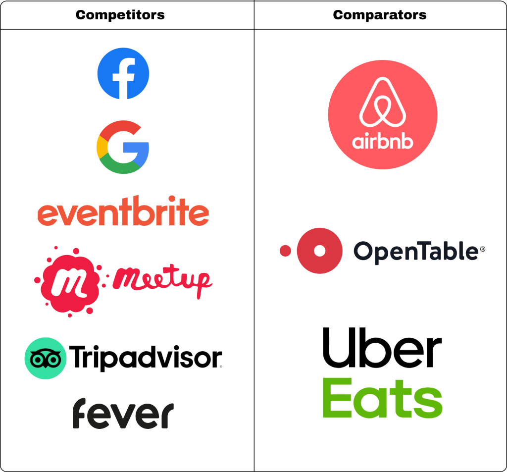
Key Insights and Features
- Location based
The vast majority of applications analysed incorporate the user’s selected location to curate a tailored selection of choices available within and near the area. Leveraging location data enhances the relevance of content for users, making it more convenient and reducing the effort needed to find relevant options. - UI Standard Practices
All the applications utilised very similar UI design layouts, which seems to be a standard practice for this type of application. Some core elements discovered includes using cards to display the most crucial information when browsing, employing a carousel to present options under subcategories for efficient space utilisation, and positioning the main navigation bar at the bottom of the screen for user convenience. - Map and List view
Applications such as Meetup, Trip Advisor, Airbnb and Google maps allowed the user to switch between map and list views when presenting options. This gives the user flexibility on how they want the information presented to them as well as gives visual context on the location of their choices to better understand it’s proximity to the user as well as awareness of the general area. It also enhances the user experience by providing another way for browsing and discovery. - Leverage Google Maps data
A majority of the applications integrate Google Maps data to display relevant location information and enable users to access directional details through the Google Maps app. This would appear to be an effective yet efficient feature, as the appropriate data are all readily accessible. - Ticket Price Comparison and Options
While many competitor applications primarily displayed and sold tickets to events affiliated with their brand, Google has a feature allowing users to compare ticket prices from various websites. This offers users greater freedom to choose where to make their purchase and enables them to find the best deals available. - Tailored Recommendations
A common feature found in all the analysed applications is the curation of recommendations based on user search habits and preferences. This valuable feature enables applications to display options that are highly relevant to the user’s interests, potentially leading to increased engagement with the app.
Who are we designing for?
After gathering the key insights, I crafted an ideal user archetype for this application. This archetype serves as a valuable guide for making informed design decisions that align with the needs and goals of the target audience, enhancing the overall user experience. With this in mind I came up with the adventure seeker archetype.
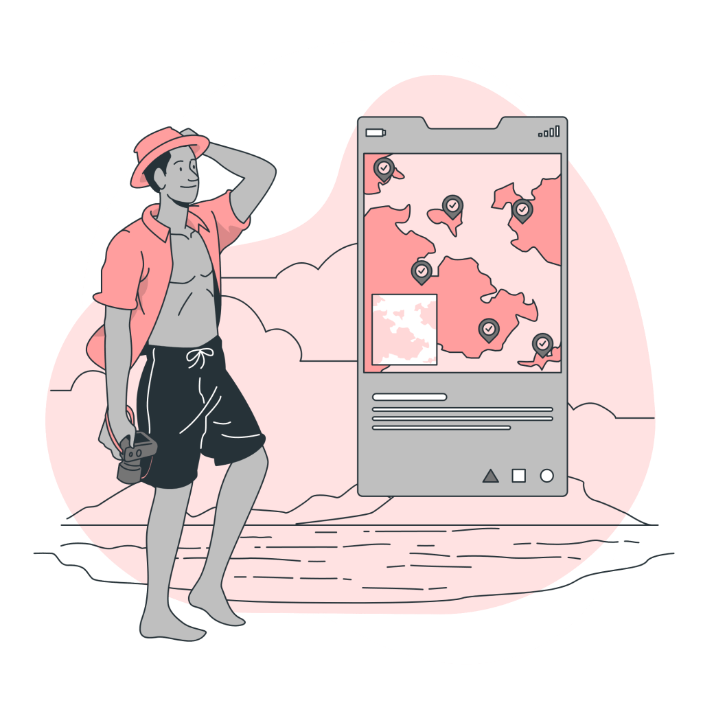
The Adventure Seeker
Traits
- Generally young adults between the ages of 18 and 30
- They are naturally curious with a desire to seek new challenges and experiences
- Open-minded, looking to trying new things and are not afraid to step outside their comfort zone
- Enthusiastic and sociable, approaching new experiences with enthusiasm and enjoys connecting with like-minded people, often being active participants in social events or group activities
Goals
- Explore and engage in a wide range of new experiences
- Expand their interests, seeking to diversify their hobbies and interests by trying out different activities and discovering new passions
- Finding opportunities for personal growth and self-discovery
Needs
- Access to a wide range of events and activities to satisfy their desire for new experiences
- Recommendations to help them discover relevant and exciting experiences based off their interests, preferences and past activities
What the Adventure Seeker needs is…
An application that allows them to explore events
and activities that may interest them.
The adventure seeker is someone who is driven by a sense of adventure, curiosity and a desire for personal growth. They actively seek out experiences that capture their interest while remaining open to exploring beyond their comfort zone, often uncovering new passions and interests along the way. For this archetype, it’s crucial to have a seamless way to discover upcoming events and activities at their fingertips, ideally with personalised recommendations based on their interests, preferences, and past activities.
Mapping out the Information Architecture
System Map
During this stage, I created a system map to outline the information architecture of the design. This process enabled me to visualise the blueprint of the design, identify the necessary pages, and understand how they interact with each other.

The Locale App
Using the system map as a blueprint, I began by developing the app prototype in low-fidelity, prioritising functionality and UI design. Subsequently, I elevated it to a high-fidelity design, focusing on integrating visual elements such as colours and iconography to refine the visual appearance and achieve the desired look for the final design. Overall, my approach for this design was to create a smooth browsing experience that encouraged exploration of different types of events and activities while also curating recommendations specific to the user.

Main Features
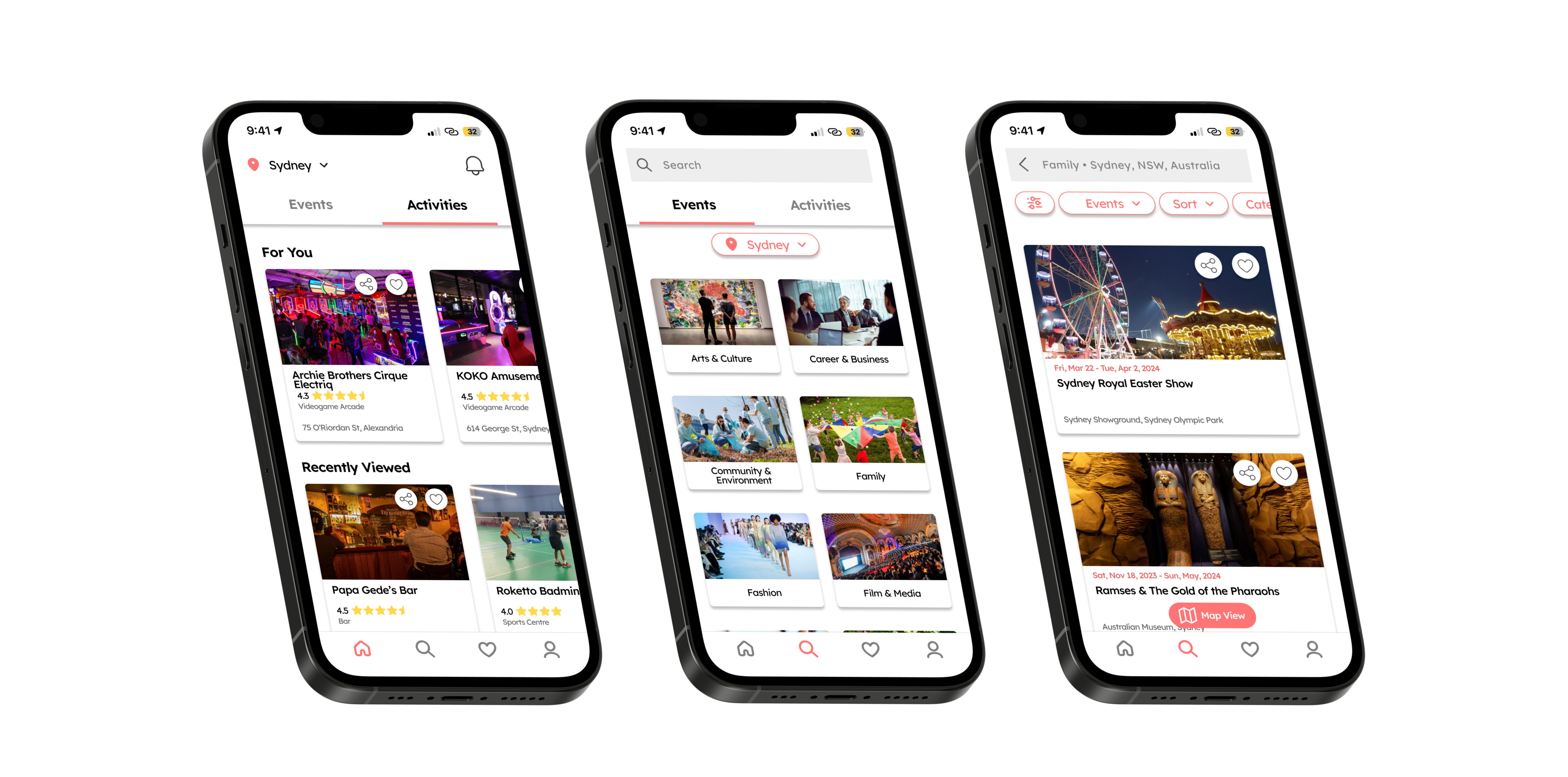
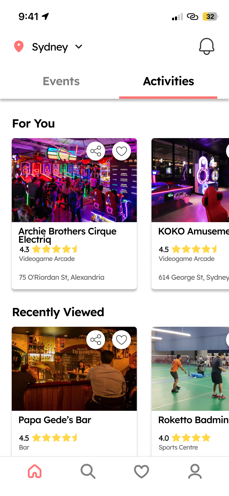
Homepage
One the homepage, users can recommendations for events and activities personally curated for them as well as the ability to seamlessly switch between these category groups.
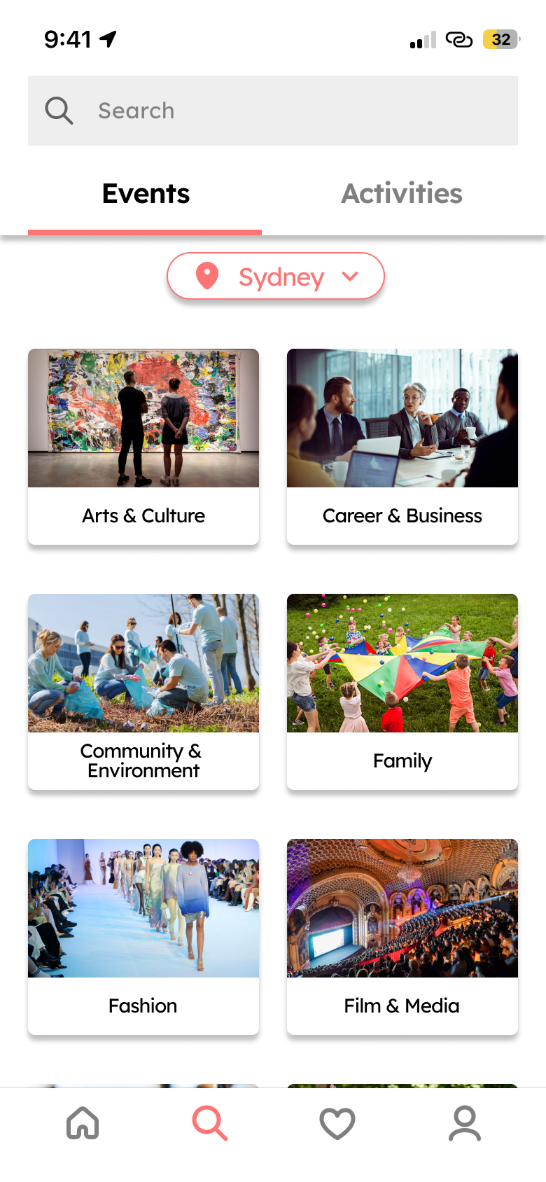
Browse and Search Page
Users can browse and search through a large selection of categories split between events and activities to discover their next big experience.
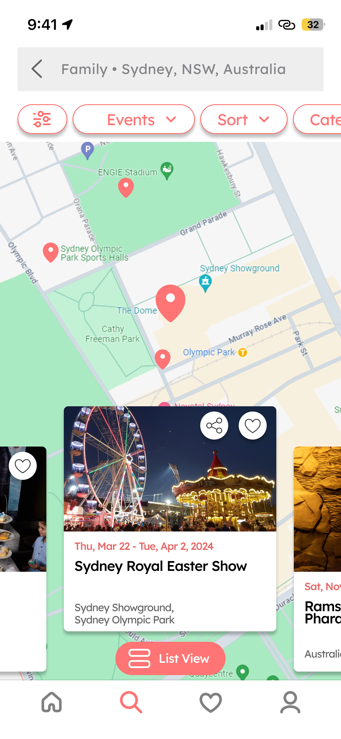
Map View
Exploring events and activities takes on a fresh perspective when switching from list view to map view, providing users with a different way to discover what’s happening nearby.
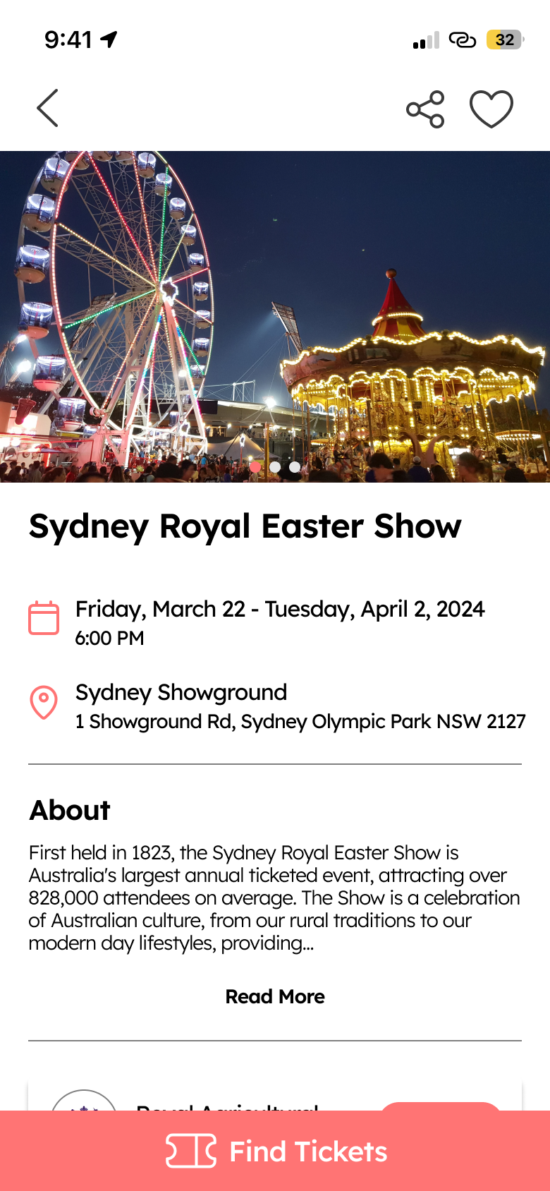
Detail Page
Explore all essential details on the event/activity detail page and uncover similar recommendations to your selected choices.
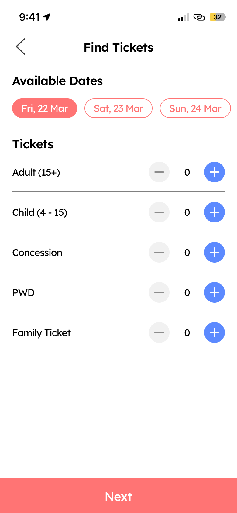
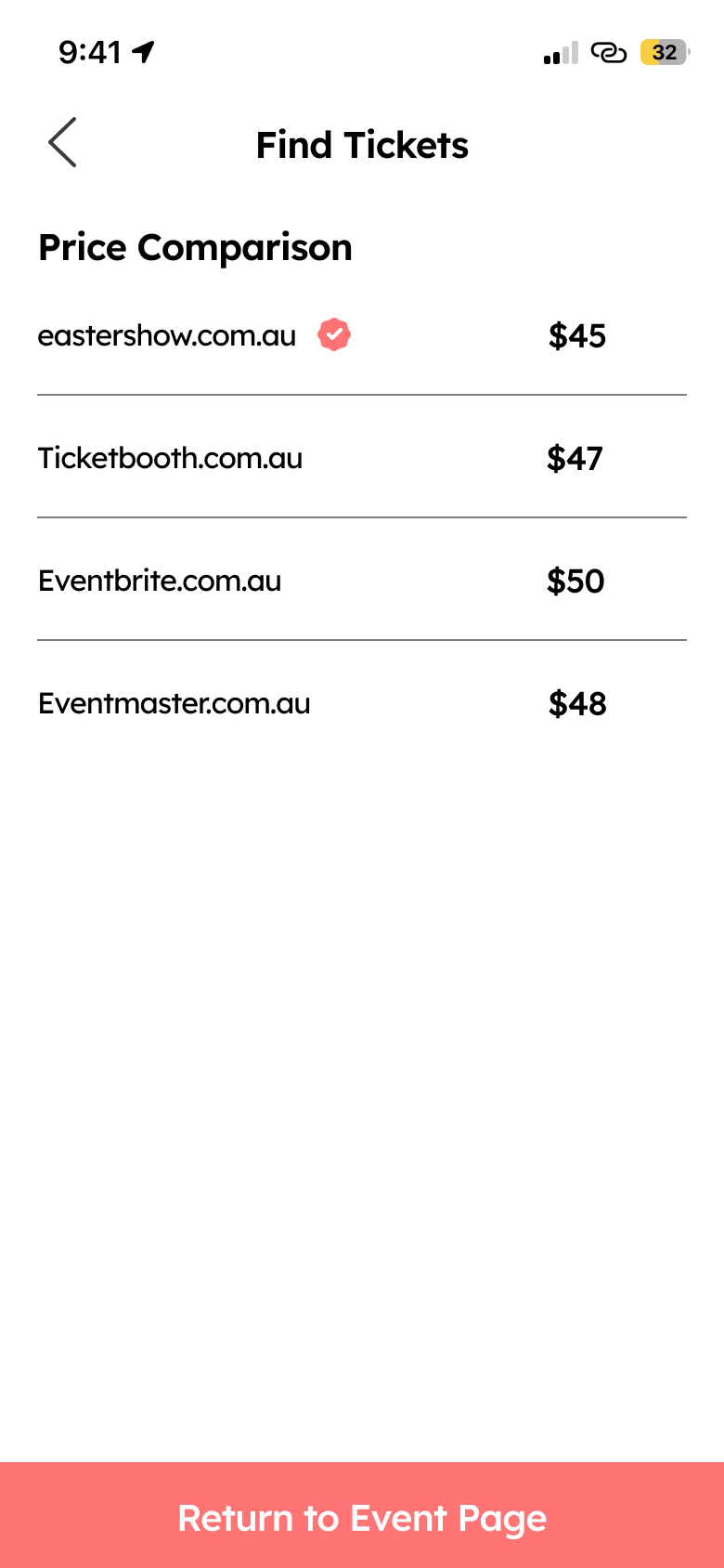
Find Tickets
For events you’re looking to attend, find where available tickets are being sold and compare for the best prices with the ‘Find Ticket’ feature.
Locale Prototype
Reflection
What’s next?
Next I would like to potentially explore and expand on the detail page with additional features that could improve it’s functionality as an events/activities app. This may include an updates section to keep users informed about recent changes to an event or activity, a review section for user feedback, or features for social engagement among users. Additionally, I plan to conduct usability tests to gather feedback on areas that can be refined, further improving the design.
What did I learn?
Throughout this process I gained a larger appreciation for the importance of competitive and comparative research. During my analysis of various apps, I observed consistent design trends among both competitors and comparators. Incorporating these trends can establish a sense of familiarity for new users, recognising certain interface elements. In terms of visual design, I’ve learned the importance of keeping designs simple instead of complicating visuals, which could potentially lead to cognitive overload.
What I could have done differently
Upon reflection, I believe that the ‘Find Tickets’ feature could benefit from further enhancements in terms of functionality and viability. There are potential areas within this feature that warrant more thorough consideration and additional time dedicated to its development.
